
Brief
Design a B5 Spiral Bound Document that incorporates the following two tasks: one, a list of one new idea a day and two, focus on the designers listed and analyse their practice - consider communication, graphic impact, research and processes used. As well as including them in your document make sure you copy the url and bookmark them on your computer.
Design Process
I started this task by trying to decide what these ideas should relate to. I settled with keeping each vaguely design-related, but not exclusively because I don’t want to omit what otherwise might be good ideas.
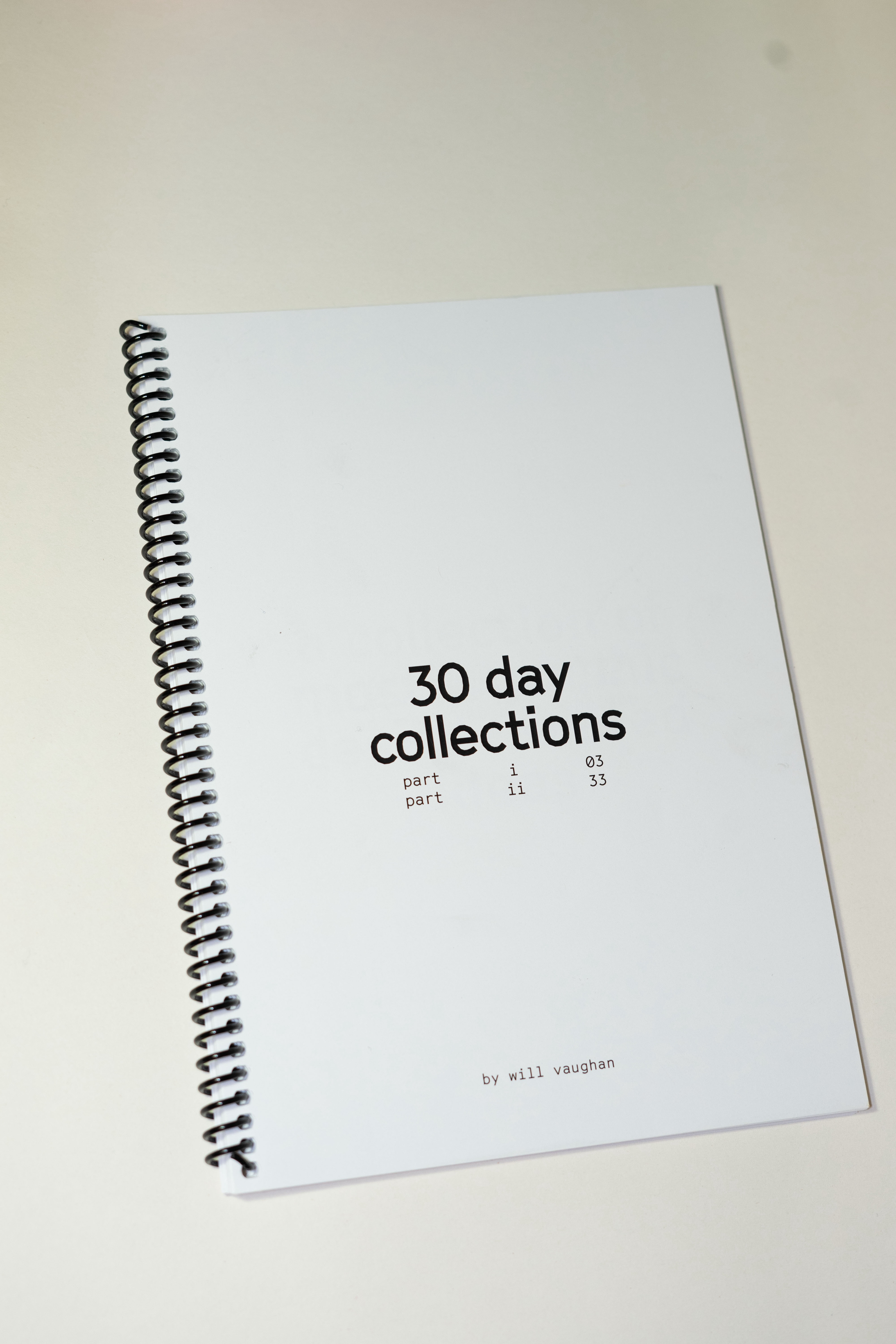
I wanted to stick with a consistent design language throughout both sections of my book in order to keep it clean and simple. With previous projects, I have used quite a bright colour palette and busier layouts on pages, so I felt this was a good opportunity to start something new. Throughout the book, other than images in task 2, all text and other visual elements are black on a plain white background. In terms of typeface, I paired Grilli Type’s Cinetype in Bold for headings in part one, with its monospaced counterpart for smaller text/page numbers. I reversed this for part 2, with headings in monospaced font and body text in Regular. I felt it hard to read extended pieces of writing in monospaced. I found parent pages really helpful for ensuring consistency throughout pages, especially in part two.
Layout-wise, the book has two main types of parent pages, one suiting part i and one part ii. This helps ensure consistency throughout the book but also allows there to be a discernible difference visually, albeit that’s mainly thanks to the different content. I used 20mm margins throughout so that the work remained both consistent and clean.
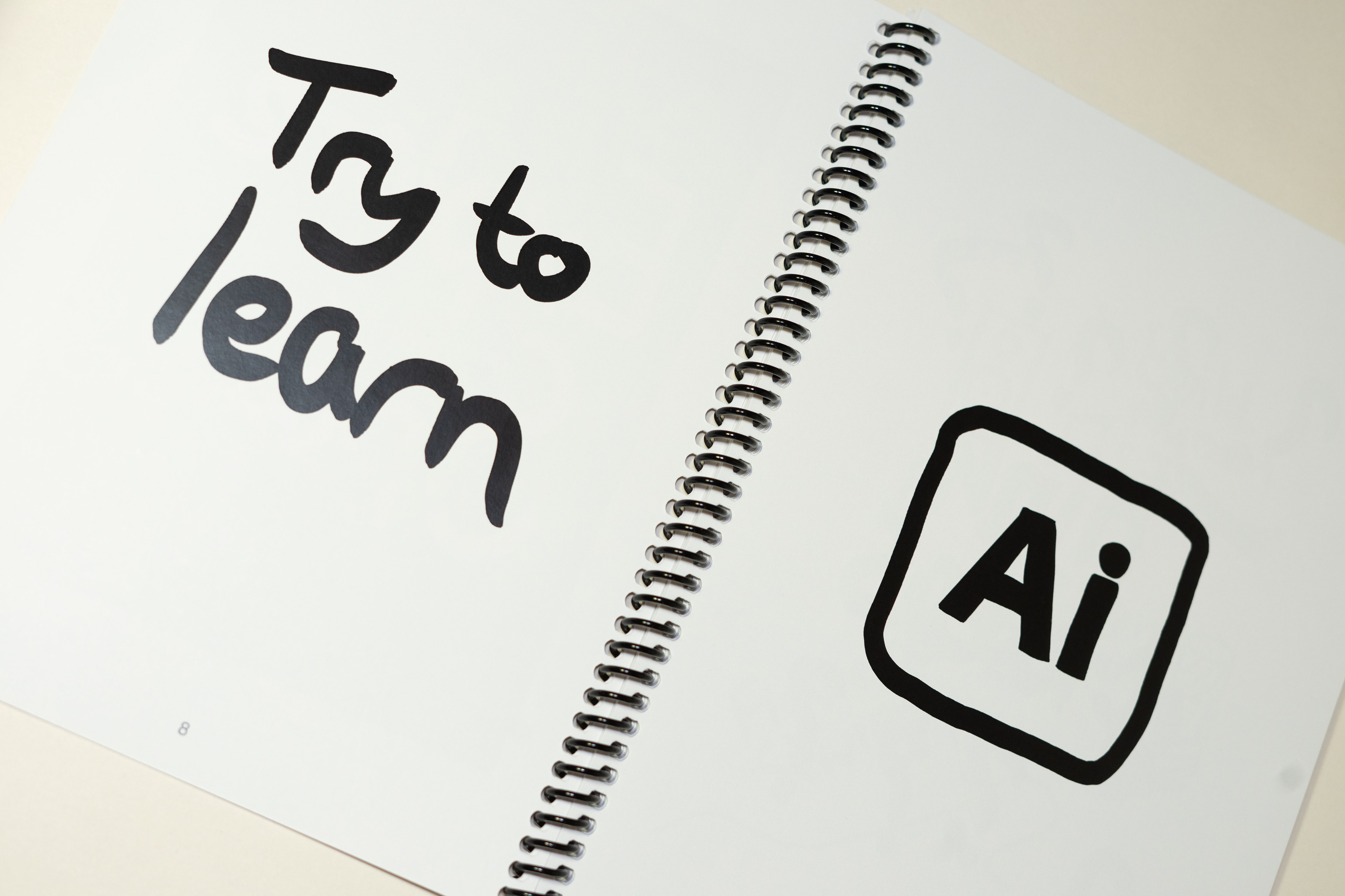
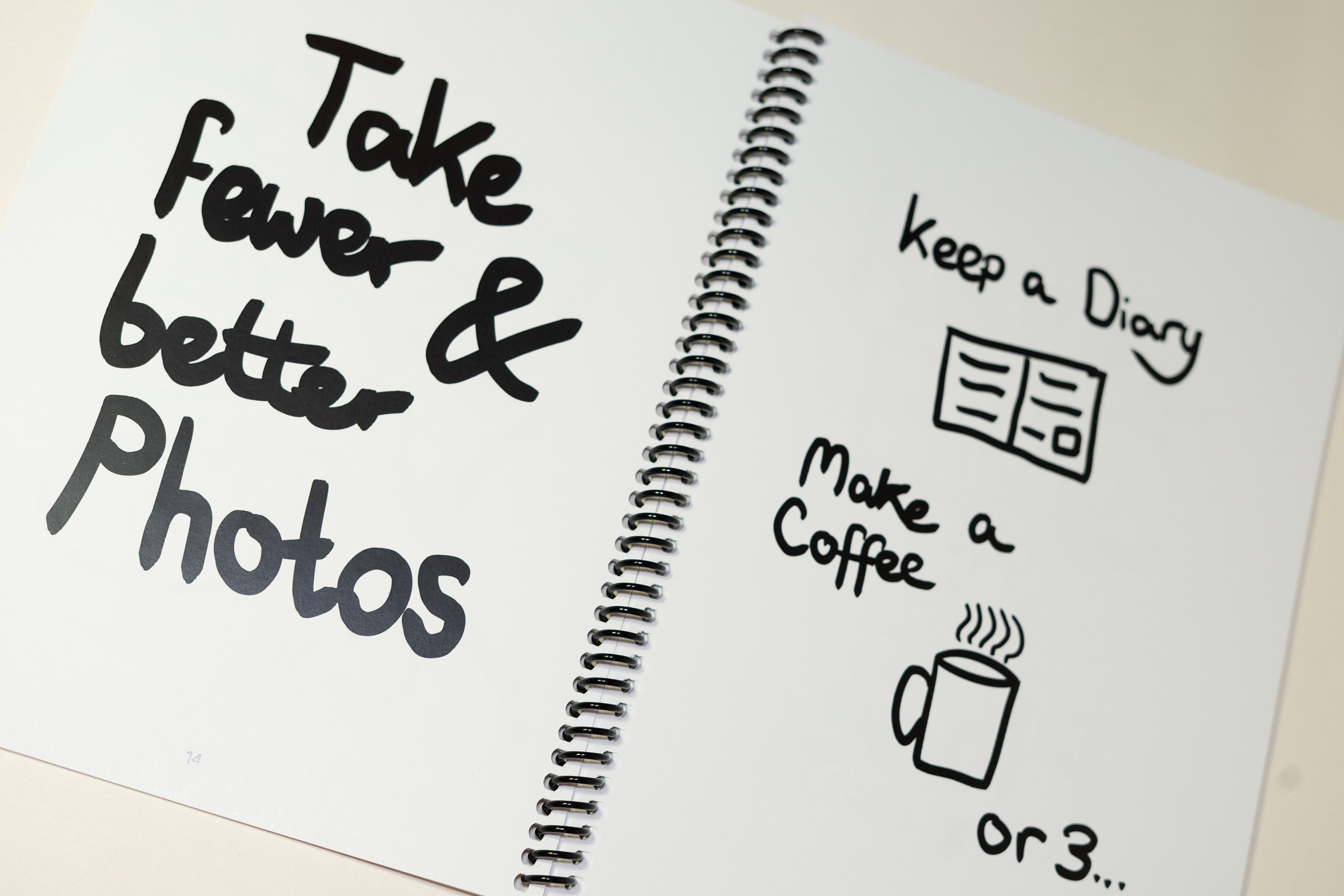
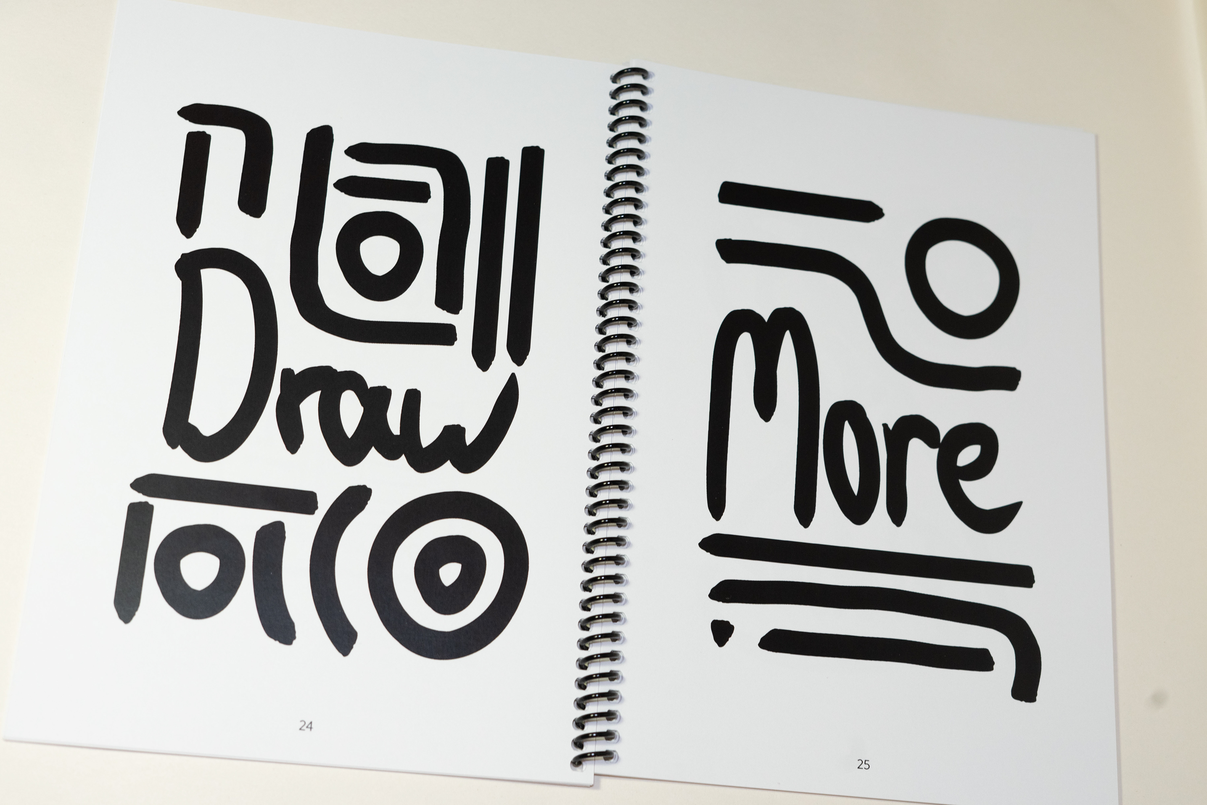
To create each page in part i, I used Procreate and the ink brush ‘Syrup’. I chose this brush because I liked the thick and smooth brushstrokes. To ensure this, I altered the pressure curve so the pen would always be the same thickness and increased the stabilisation setting. As well as small pieces of writing, I felt it important to include some illustrations to vary the forms of imagery in the book. This helps the book become more visually interesting. I also wanted to fill each page as much as I could to make the most of the space and give the idea that ideas are almost falling off the page.
I found part ii slightly harder to gather content for. I found it very interesting looking at each designer and studio and seeing the breadth of practices from one to the next. However, especially with design studios, I found it difficult trying to analyse their graphical impact and methods of communication simply because each had such vast and varied portfolios. When I was struggling, in a few cases, I decided to analyse one or two projects more in-depth rather than their whole practice.