
Policies exhibited in the below materials are purely for documentation purposes only and do not reflect personal political views.
Brief
Using a selection of material from the Election Address Collection archived in Bristol University’s Special Collections Library, you are asked to design and make a publication that can also be an exhibition. Create an exhibition catalogue, or a publication that can be deconstructed and displayed as an exhibition.

Content
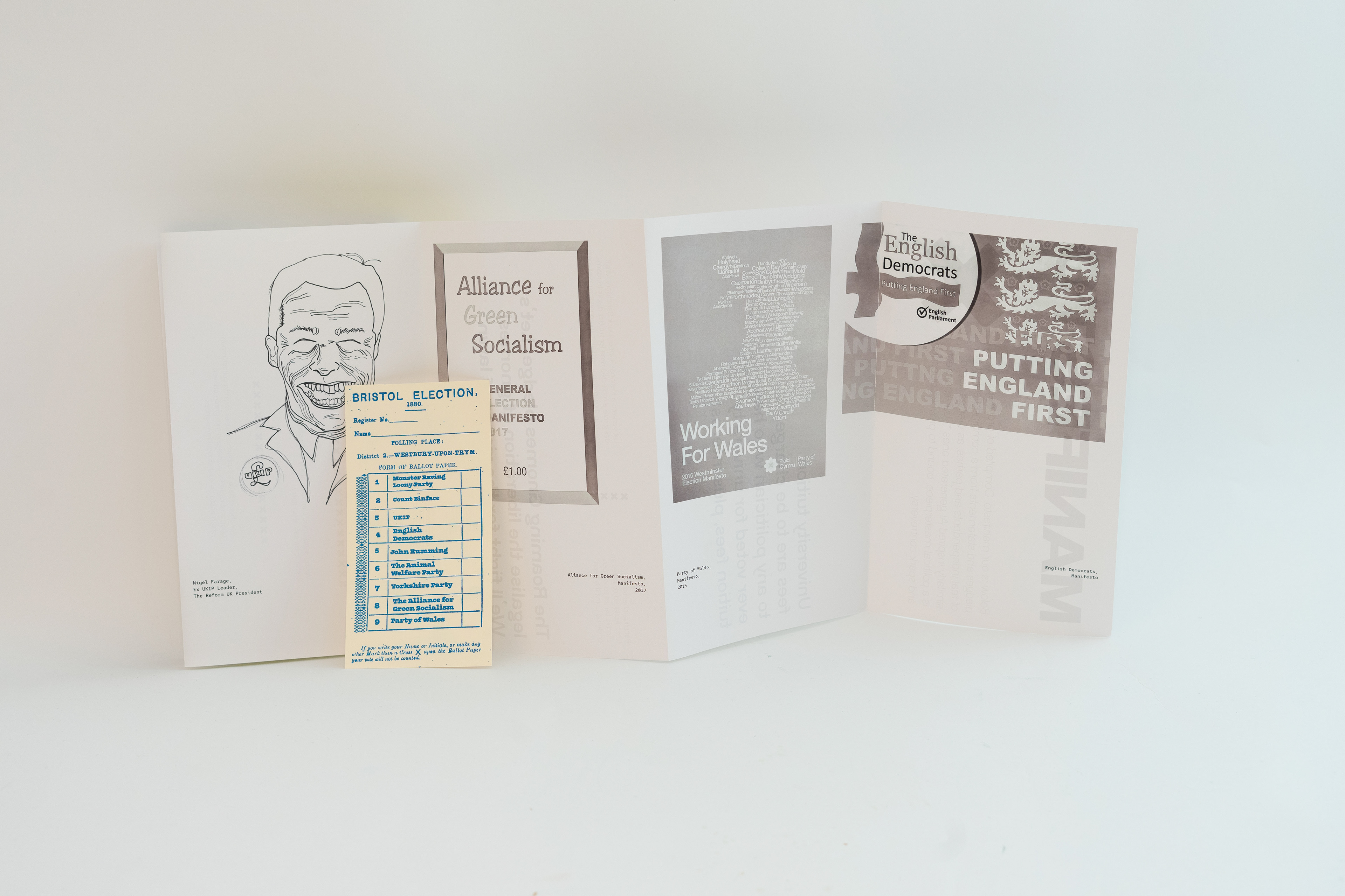
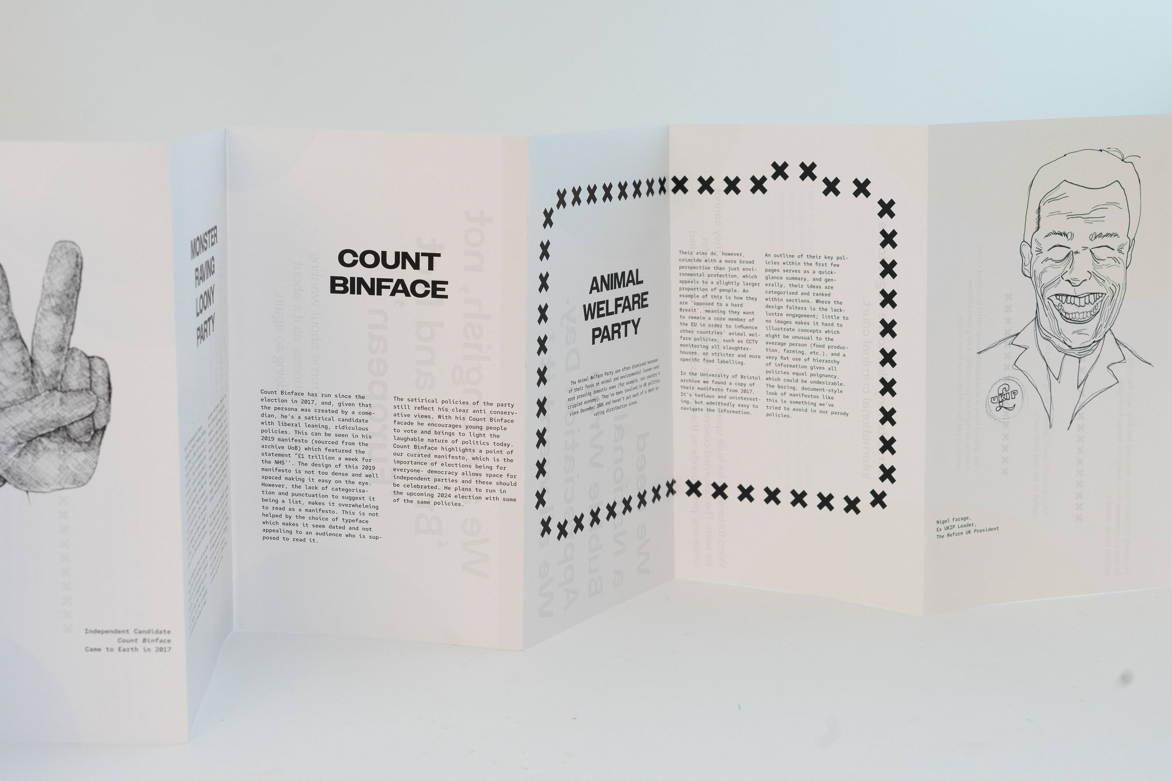
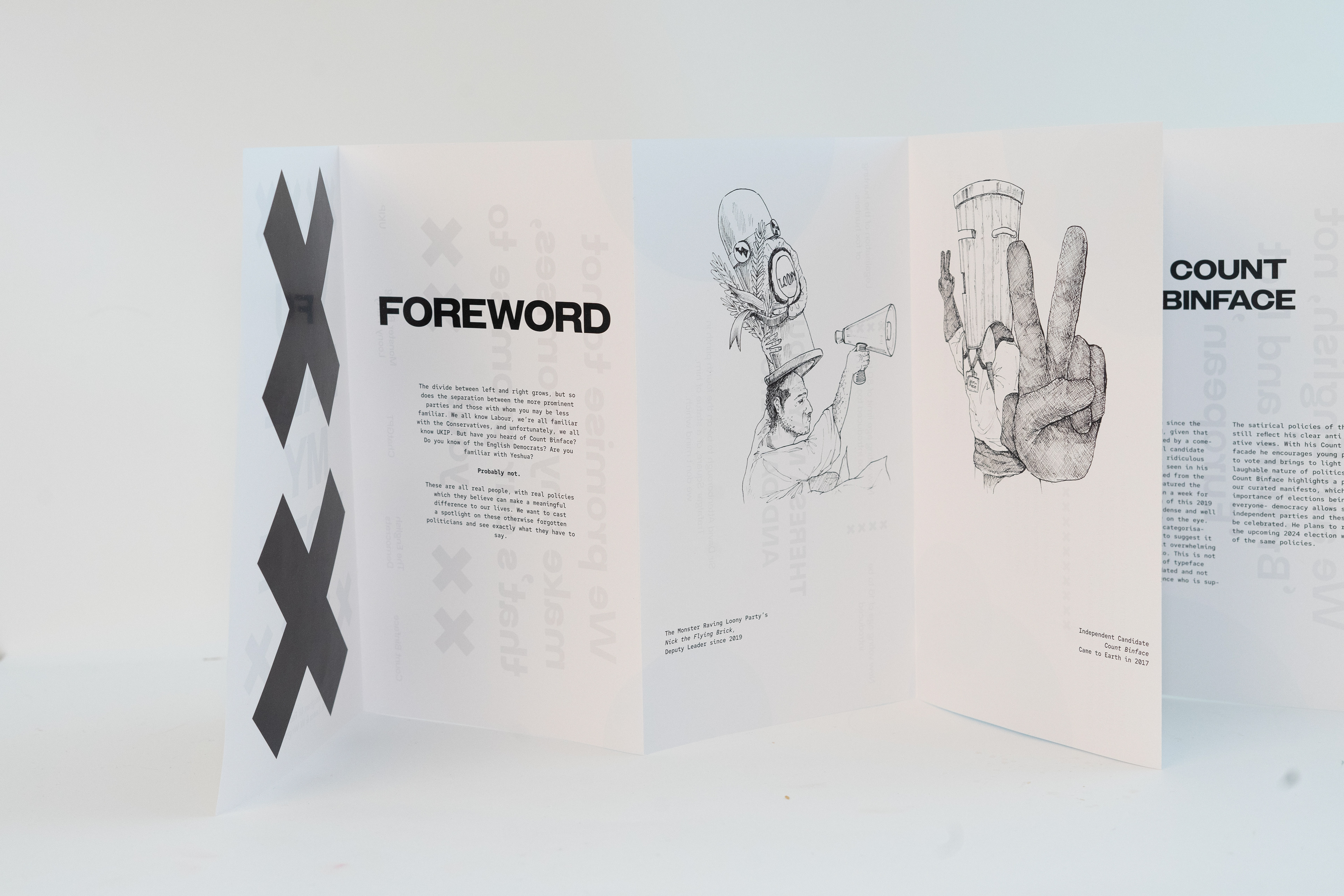
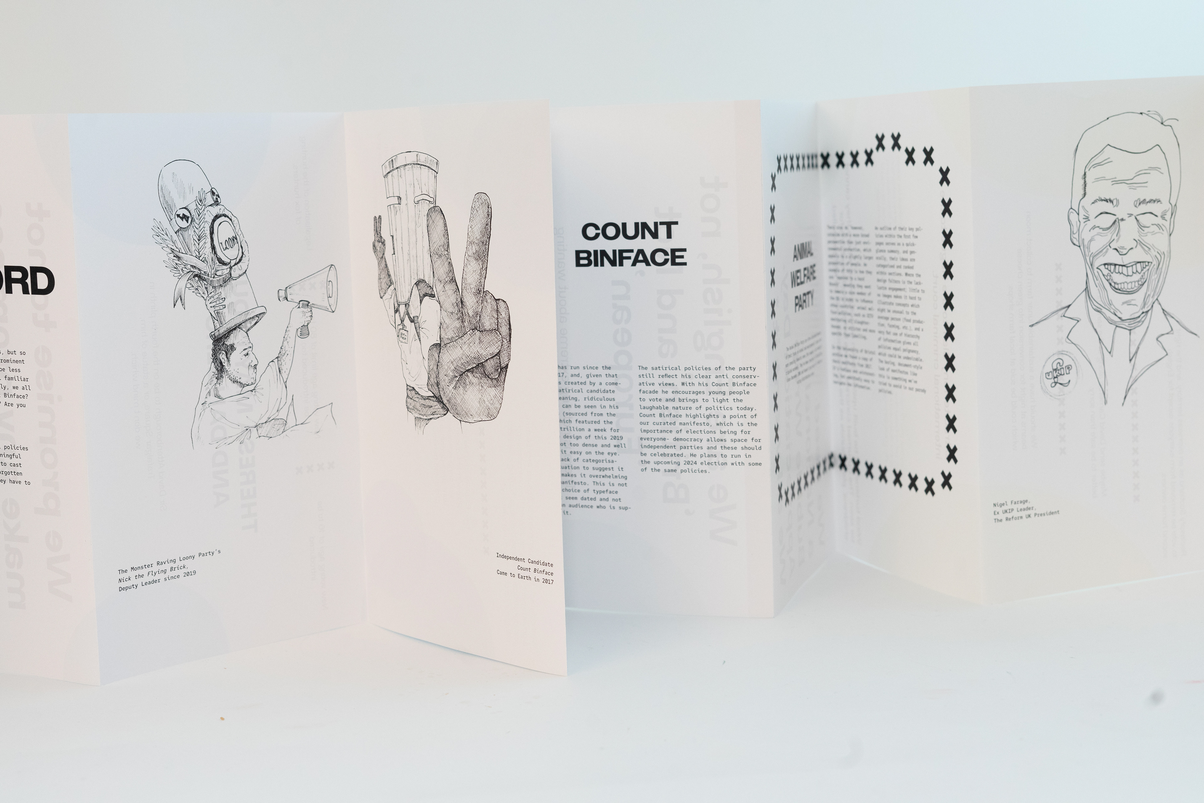
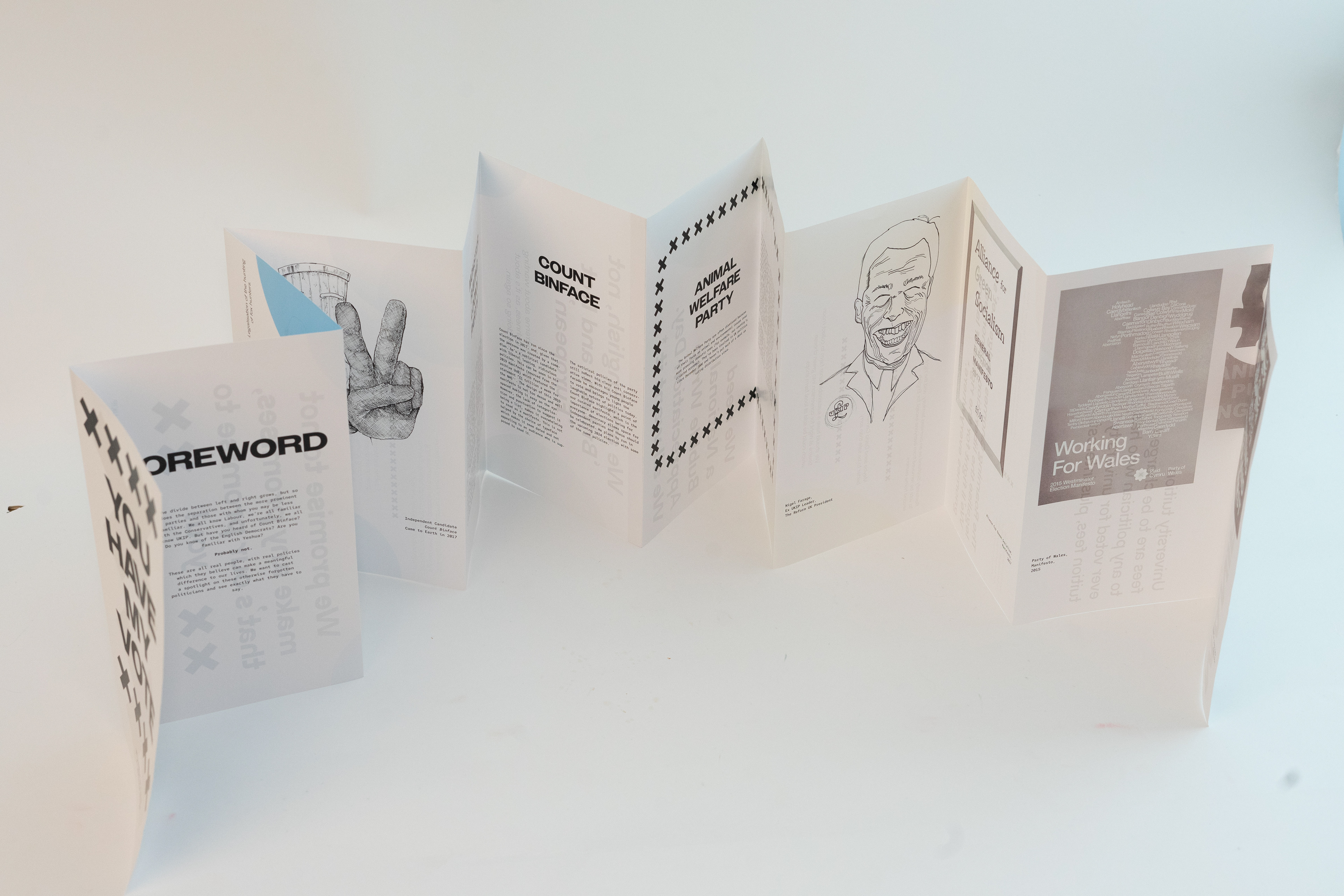
We had decided to focus on smaller and independent candidates. We wanted to make sure our content would still be focused on the material of the archive. One of our original ideas was to create Pokemon-card-esque fact files of each candidate, each profile with inserts of cards forming the exhibitive aspect of the publication. However, we soon realised we probably didn’t have enough content to fill 24 pages worth of profiles. It also meant that we wouldn’t be able to include much imagery of the archive itself.
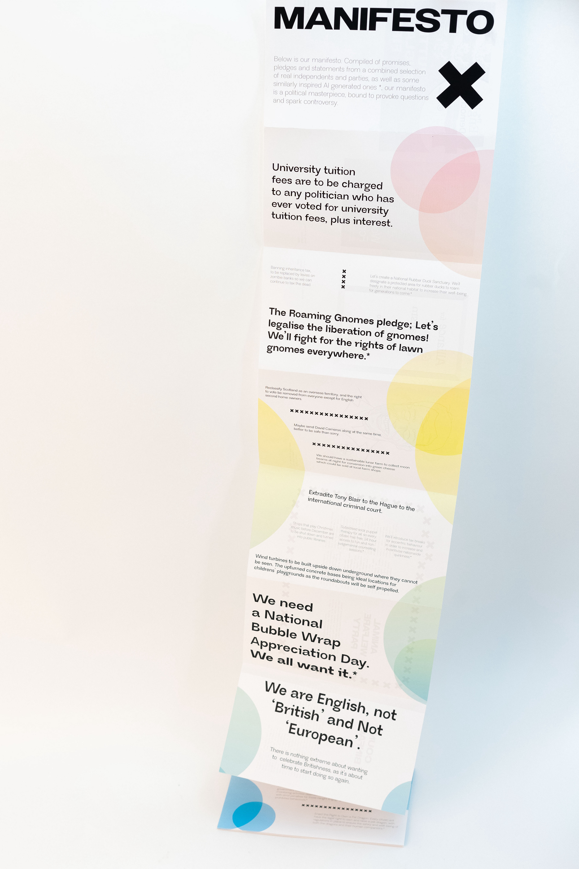
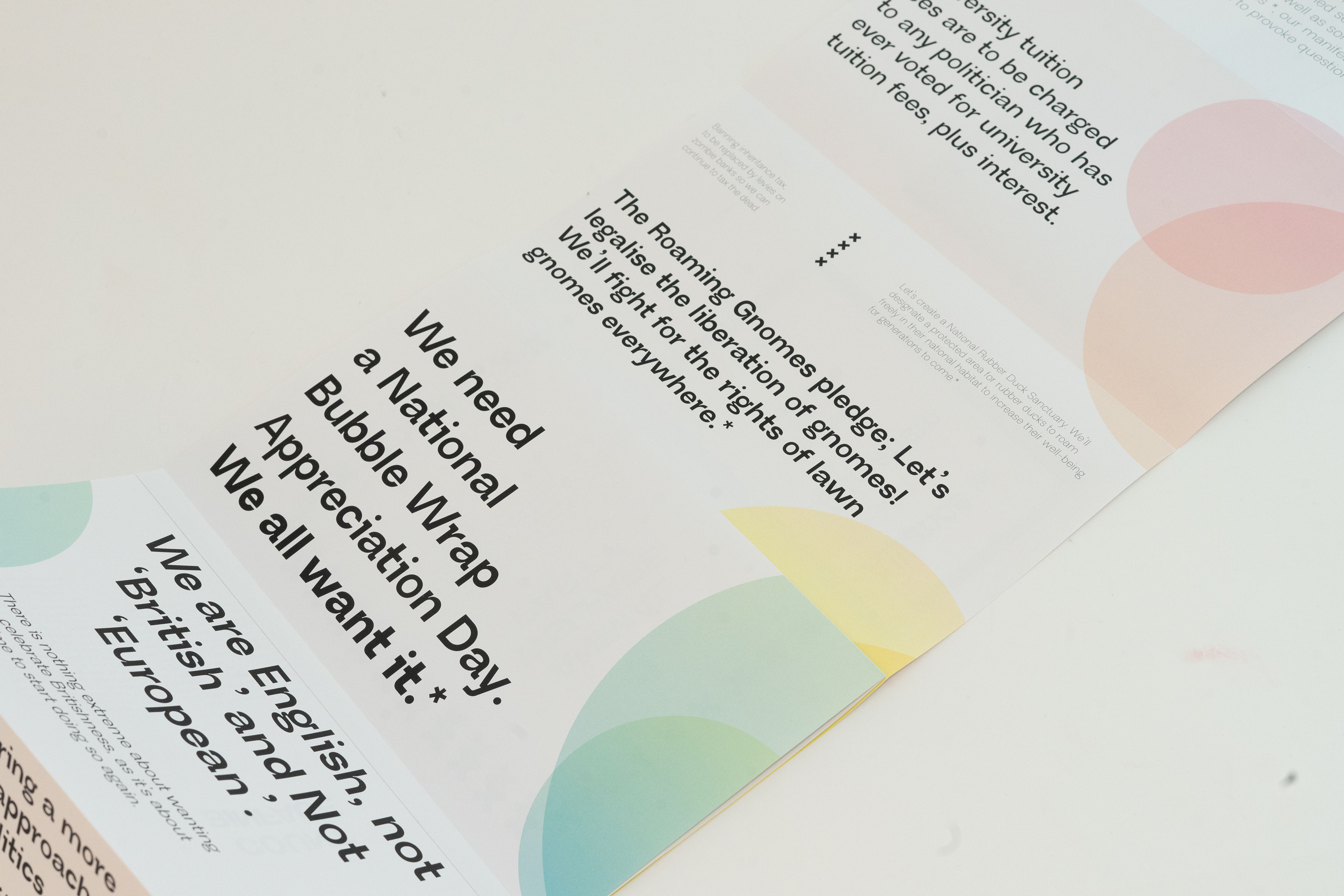
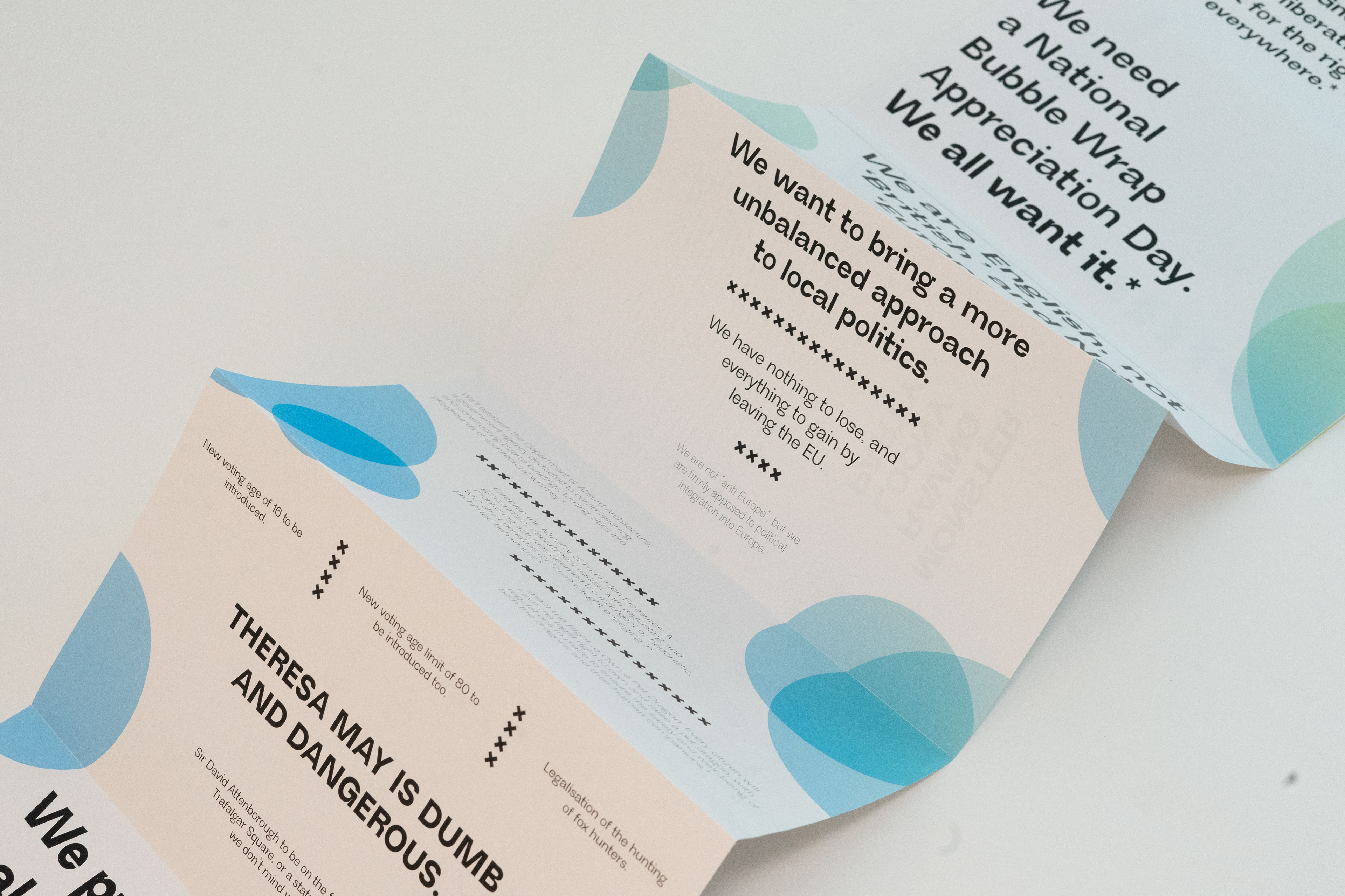
Considering our concertina was made up of effectively 2 different spreads, we decided one side could display imagery and any information we found out about each part. During the second visit we managed to get scans of some of the previously mentioned political manifestos, a lot of which had some fairly questionable policies. At this point we realised the other side of the publication could be a manifesto, it being a compilation of all these policies found in the archive. It could then be hung as a portrait poster, comically long, as if it were falling off of the wall and filled with all of these ridiculous ideas. It was also recommended that we use AI to help generate some more policies.
Now we wanted to make a concertina, the next step was to see what kind of scale we could produce work at. When making mock-ups we had been using a4 paper folded along the short edge but this would result in the poster side being too thin and less easy to read from any kind of distance. To fix this, we settled on a slightly taller page size 148mm x 250mm although this meant for 24 pages, the entire spread would be 1776mm in length.
Our next step therefore was to try and find a print shop that could produce an outcome of this format and size. To help illustrate what we were talking about, we brought a to-scale mock-up of the entire publication. When we reached Hobbs, we were given a rough quote, as well as the paper stocks available. As our work was to be double-sided, the widest paper available reached roughly halfway across the spread (320mm x 1020mm). We chose a 160gsm silk paper stock so that when presented as a gatefold or poster, it could support its own weight and not fall.
We added a 20mm page to each spread to allow us to attach each spread.
For the dust jacket, we chose a sturdy card (a3 cartridge paper 140gsm) which could fold around the rest of the publication. We chose this over a coated paper to both add a new texture and make the publication a little more tactile and easy to hold.
Cover & Name
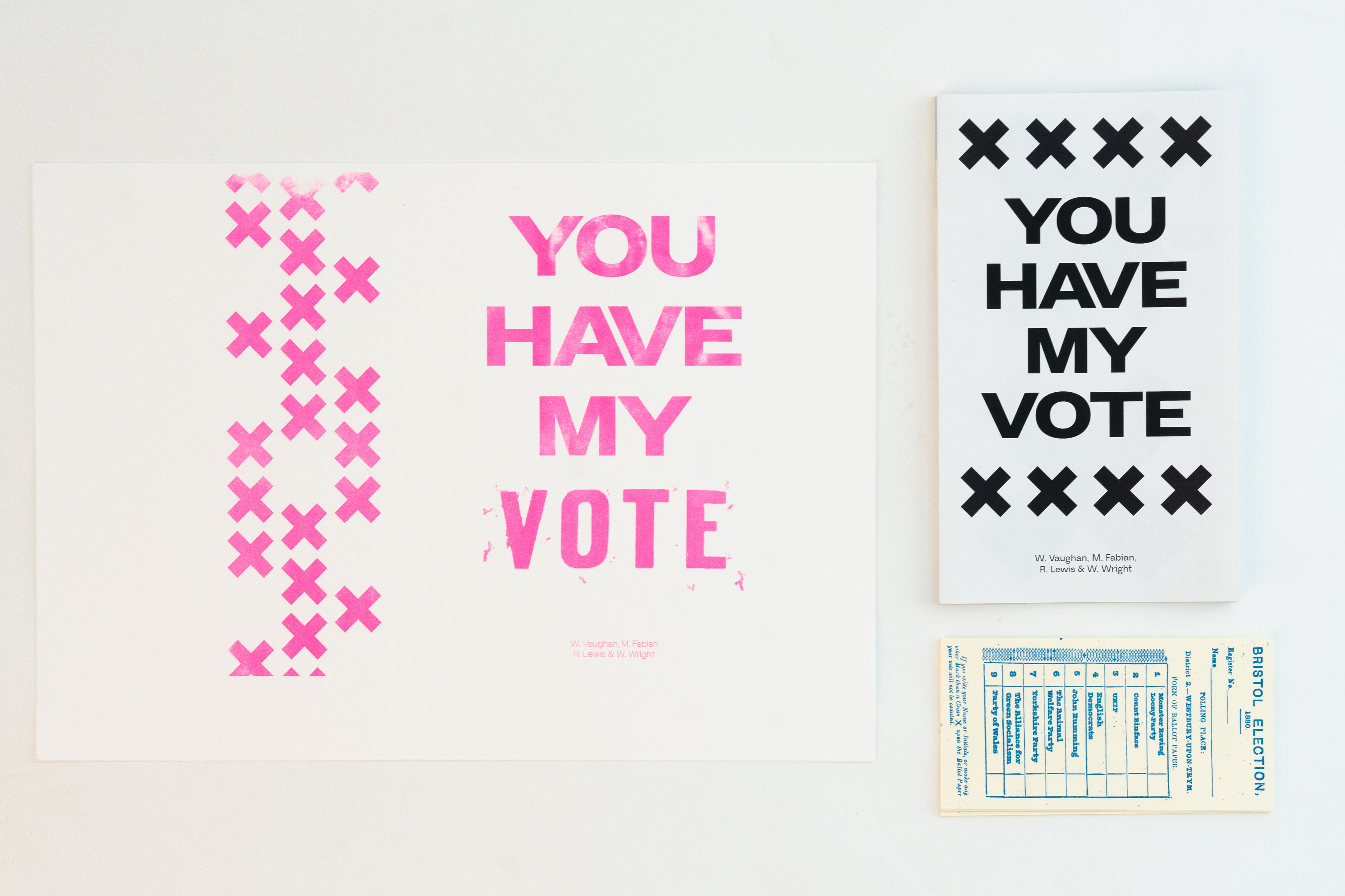
Our name ‘You Have My Vote’ takes inspiration from Jeremy Deller’s “Strong and Stable, My Arse” poster. We felt it related to Deller’s work in its satirical and sarcastic tone. To experiment with different media, we decided to Riso print our cover, resulting in bold and vibrant type. We also made a pattern on the rear cover from the same crosses used throughout the publication.
Typefaces
The only typeface that remained consistent throughout the whole creation process was Owners Wide as headings in 34pt. We liked that it was very clear and legible and easily read at a distance. Originally, the body text throughout was Monsterrat, although towards the end of the project, we received feedback that it looked a little corporate and boring. This was semi-on-purpose because a lot of the publications we looked at did seem overly corporate, but I much prefer the look of our publication now. On the research side, we switched to a typewriter-like monospaced typeface, Red Hat mono in 8pt. On the manifesto, we switched to a more intricate sans-seriffed typeface I had found a couple of weeks prior, Neue Regrade (a variable typeface). We used multiple different sizes and fonts to vary the impact of certain statements.
Colours
We originally had decided on an orange colour running throughout the publication, before realising it was of course connected to the Liberal Democrats. Instead, for the research side at least, we used only black and white with a slight sepia effect added to the imagery to relate to the idea of an archive being a collection of often old material. The orange turned to pink, although we received feedback that the second half of the publication felt a little bland and lacking in many visual elements. To respond to this idea, I created a gradient spanning red to blue to relate to their respective affiliated parties. To brighten this side up a little, I set the opacity to 50% to make each colour a little more pastel. This helped to make each section of the publication more defined. At this point, to make the publication more visually interesting, I started experimenting with using crosses (like you would see in voting cards) as dividers or as images on their own.
Inserts
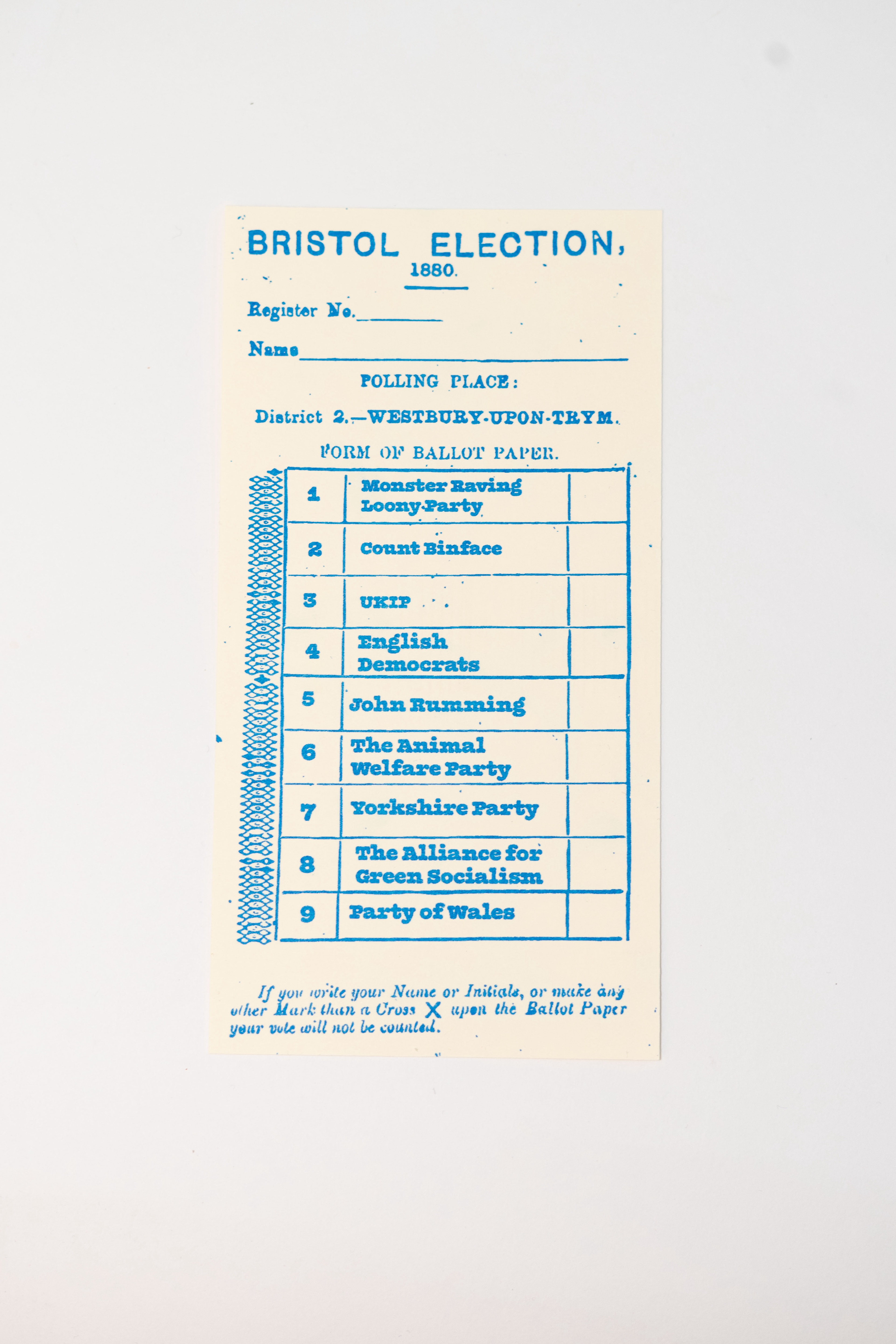
The voting cards were originally more of an ‘if I have time’ addition to the publication but I am glad I ended up making them. Based on a polling card found in the oldest section of the archive, I added the scan into Photoshop. Next, I found a suitable typeface and started to extend the table to make space for the alternative candidates. I used WhatFont to try and determine the closest typeface I could use and settled on ‘Olivita’. To match the same aesthetic as the original, we used a cream 160gsm cardstock printed with blue Riso ink. I am very happy with the results.