
Brief
Take the bus to the destination you have been assigned and gather some news from the location - do this by talking to people, making observations, looking at posters etc. You should aim to collect 25-30 pieces of news. Gather them as voice notes, through photos or write notes in your sketchbook. Gather as much detail as you can.
In your teams of three collate and edit all the news you gathered from your locale, this will form the basis of your newsletter. Identify what skills you have between you and delegate tasks. You'll need to work and make decisions fast, aim to have your final designs print-ready by 2.30 pm (print tests out as you go along).
Process
As there were 4 of us who went to sea mills, we split into groups of 2 and I was working with Cerys. In order to incorporate colour, we liked the idea of printing onto coloured paper, much like in the previous brief, Engage Enrage. We were also keen to use the Riso although by this point had not decided exactly how.
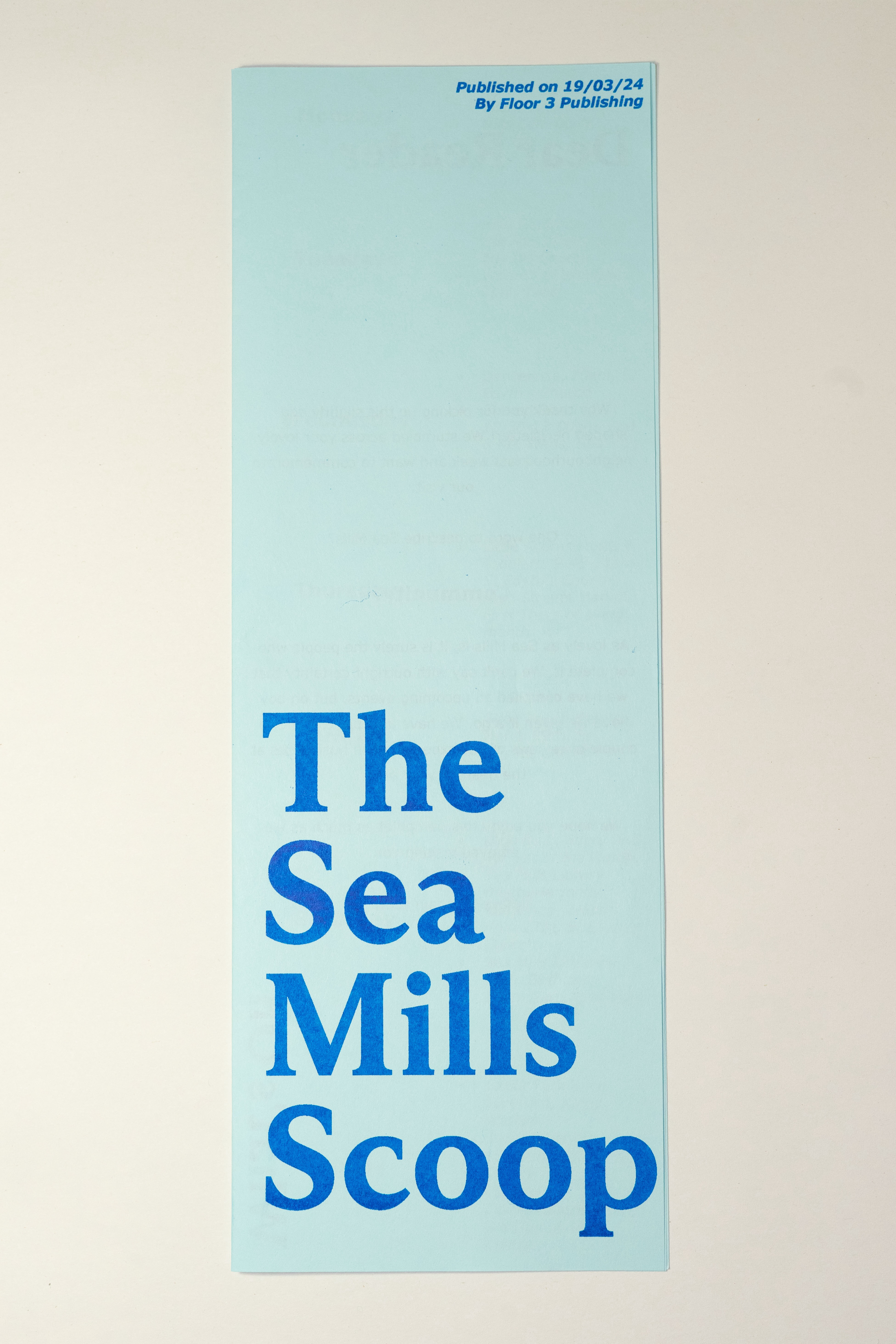
There was some coloured paper set aside for us to use, from which we chose a light blue because of the street of blue houses I noticed during the visit. Like in The Chatroom newsletter, we liked the idea of folding a4 on the long edge for our newsletter, although to comply with the brief, we would also need another piece of paper inside. This turned our project into almost a small booklet. Next, we produced a mock-up, splitting up our ideas for content and setting them out on each page.
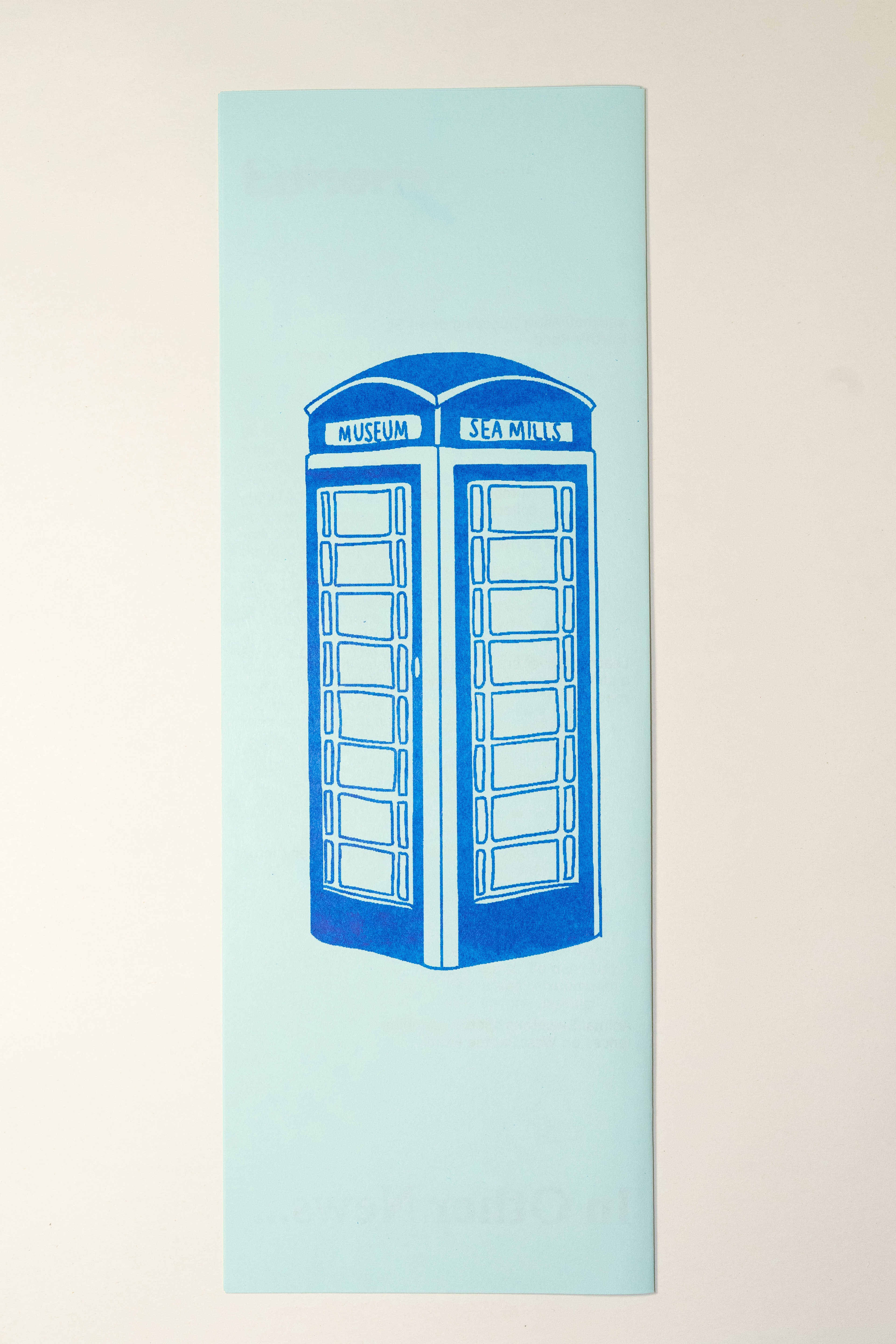
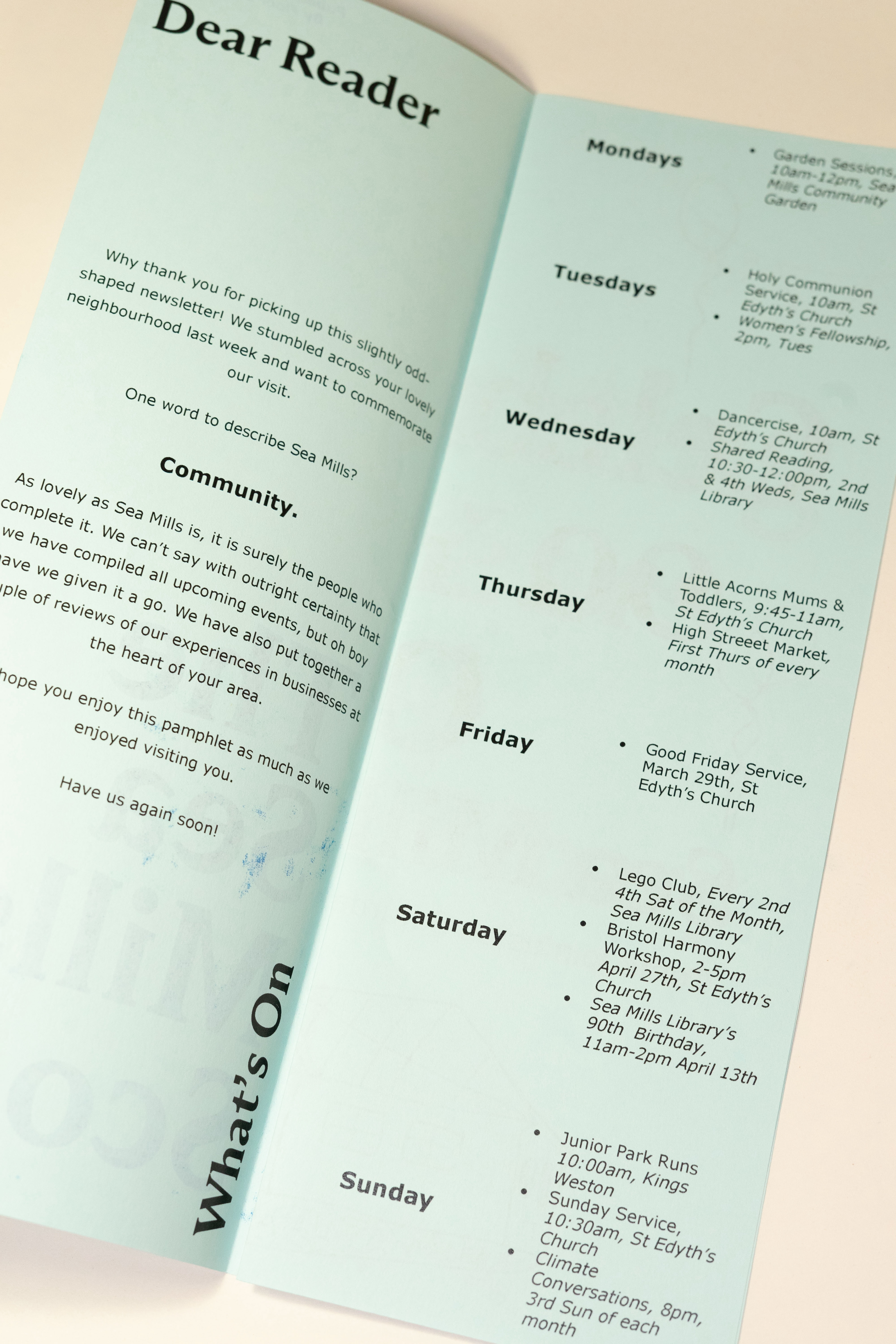
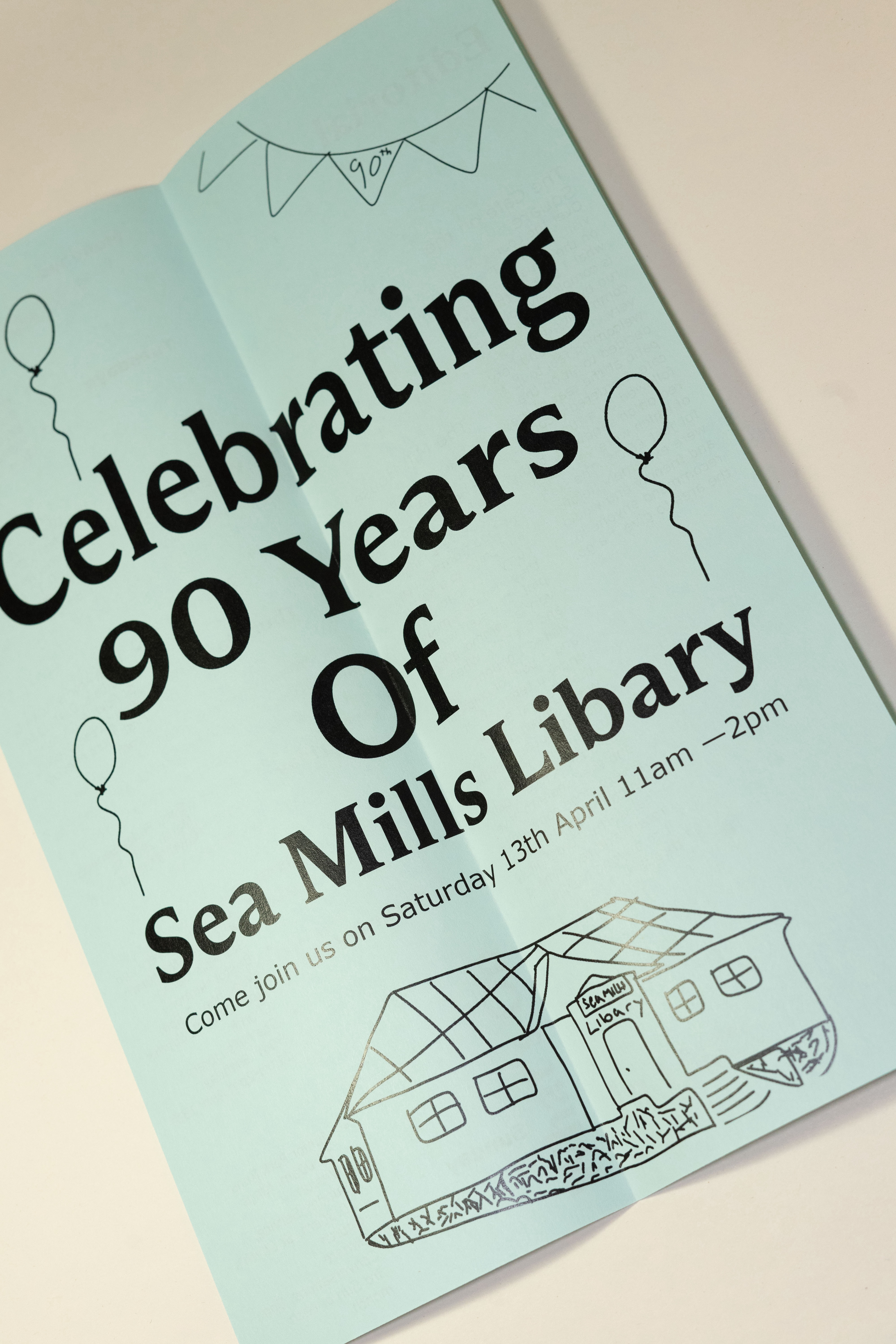
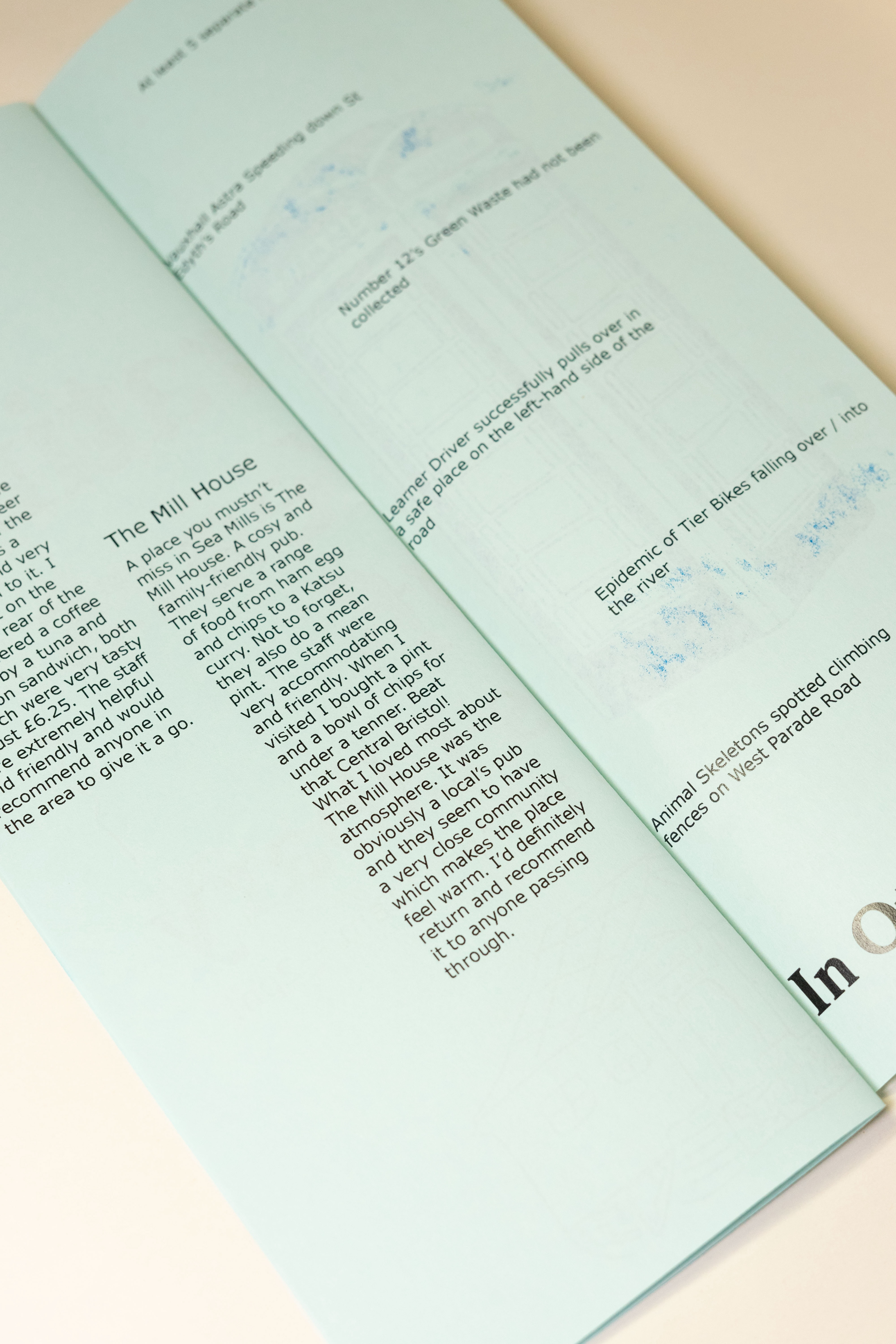
For our content we started off with a little statement introducing ourselves and why we are producing the newsletter. On the next page, we produced a little calendar of upcoming and recurring events for each day of the week. Luckily we managed to include quite a lot of content on this page because of the number of notice boards we photographed. When Cerys visited the library, she was told it was their 50th Birthday coming up soon, so we dedicated the central spread to a poster informing the reader of the event. They could also remove and display the poster for others to see. In the second half of the newsletter, we included our reviews of the Cafe and Local Pub in the area, set out in 2 columns (like in the calendar section). The final page included some more random pieces of news we collected, for example, ‘No.12’s green waste not being collected’ or ‘5 separate fridges found outside’. For the rear cover, I made an illustration of the Sea Mills Museum, the phone box which seemed to be Sea Mills’ most well-known feature.
For headings, we used a typeface from Dinamo, ABC Arizona in bold at 37pt. We chose this font because it felt more familiar than a lot of other seriffed ones we found. This felt important being that we would be distributing the publication to people who would never have seen it before. Inside as body text, we chose Verdana because it is a very clear and easy-to-read typeface even in 8pt. Such a small point size was necessary due to each page being 105mm in width.
So that we were still technically using just two colours, we decided to Riso print the front and rear covers in an effort to make the leaflet a little more attractive to pick up than your average newsletter. Whilst creating another test print, we realised that an inside spread printed onto white paper looked slightly more interesting than blue paper again, as if it were a proper book with front and rear covers. However, this wouldn’t quite fit the brief. This would have made our work more similar to the previously mentioned pamphlet by Valentina Valveroad, utilising more than one paper stock.