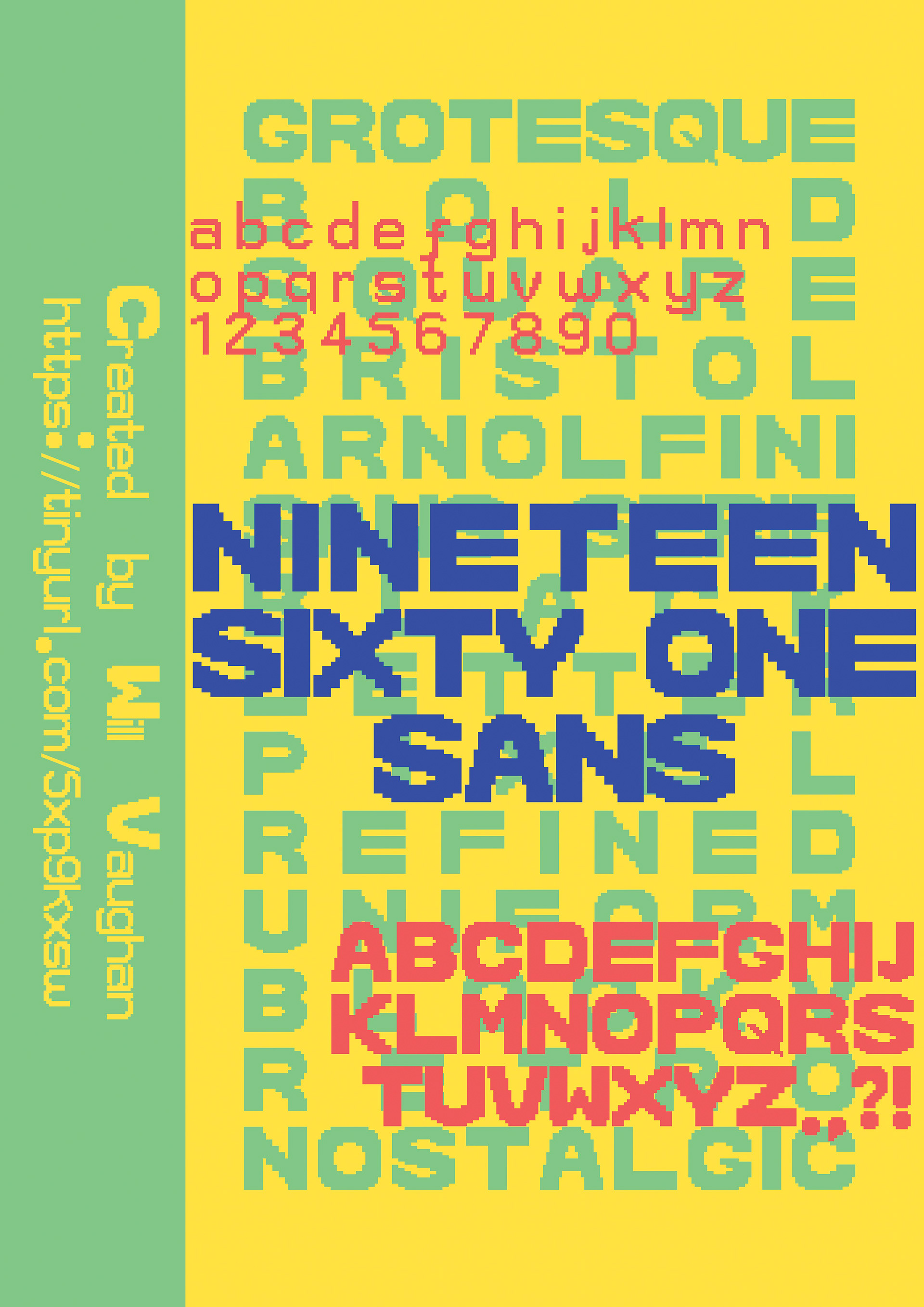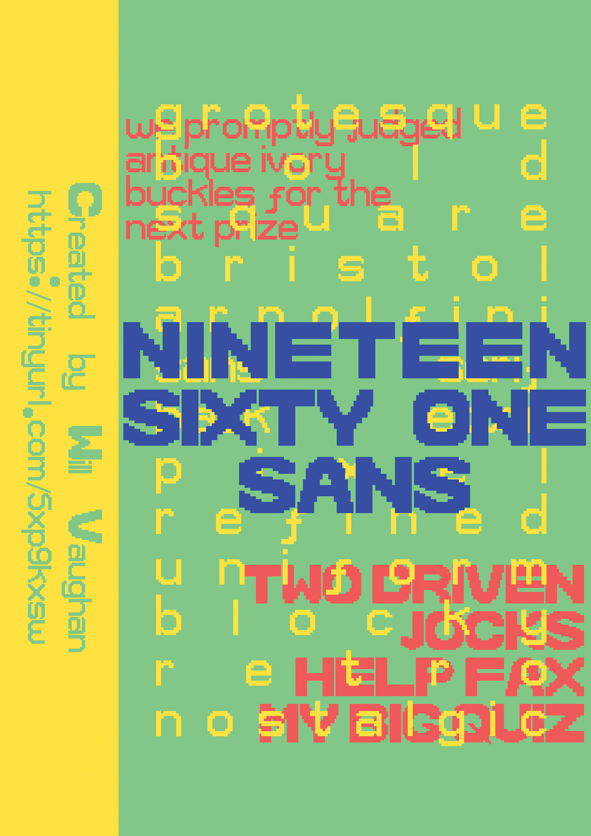
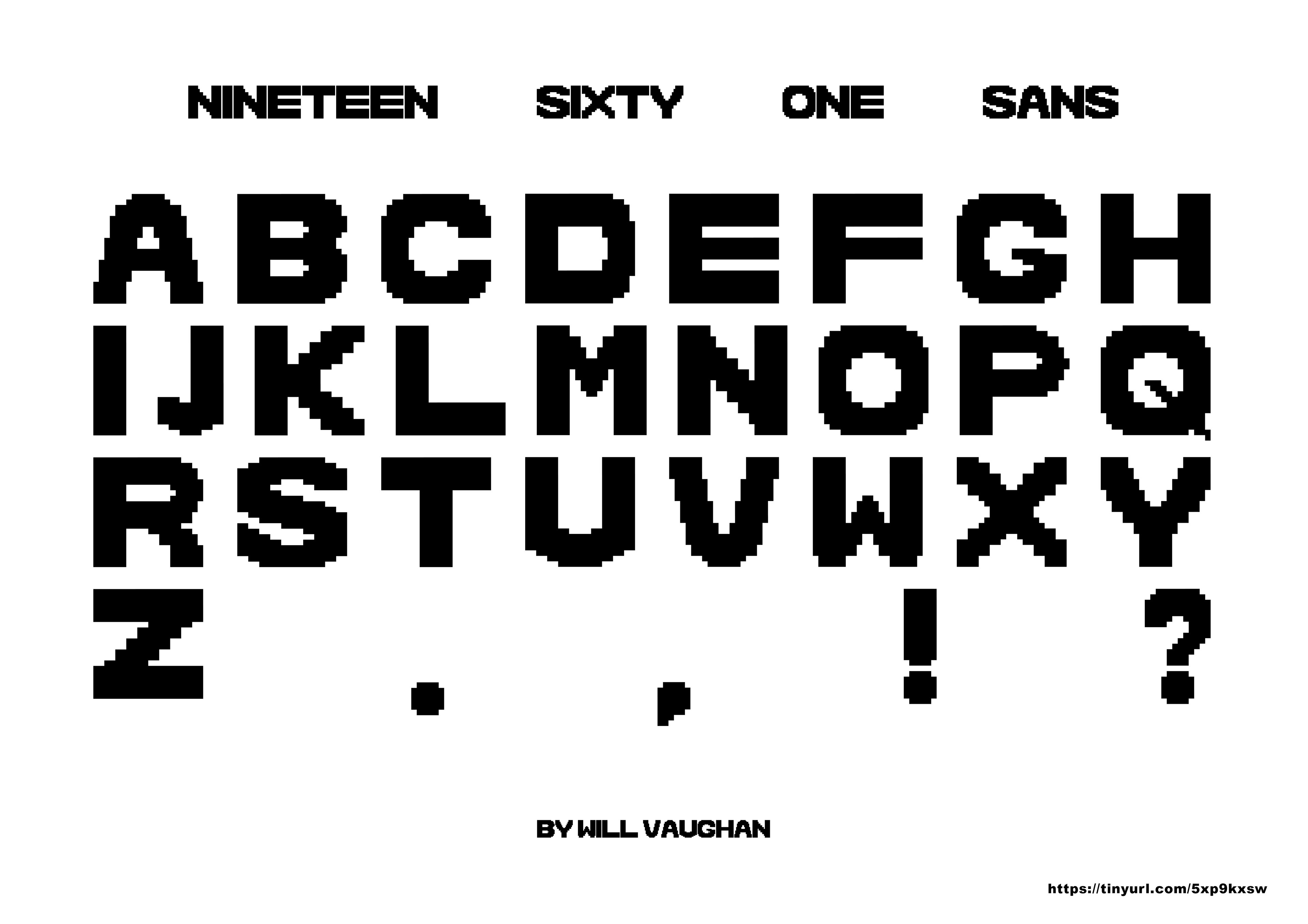
The typeface from which I took inspiration is the grotesque, square, black letter font visible above the windows of the Arnolfini. I started with rough sketches of the font, before then translating them onto grids. Whilst I did struggle with the grid process, it definitely helped in the long run when it came to designing my own font in FontStruct.
Shown above is my typeface, Nineteen Sixty One Sans (named after the year Arnolfini was founded). It takes inspiration from the square frame each letter has, and uses as much space as possible, whilst still remaining legible and easy to read. Fontstruct has various limitations, such as the fact that you cannot create curves. One workaround for this would be to use a large grid, however our brief limited us to just 24 x 24. In my own work, to try and keep each letter as uniform as possible, I used a 10 x 10 grid. I then used various other quarter and half squares. Each letter form is as grotesque as I could create them whilst remaining legible, however, certain letters like the letter ‘E’ have smaller parts than others.