
I decided to choose the Emergency Broadcast System prompt to work from. To write the monologue, I headed to Arnolfini Cafe, I find I work best anywhere but my room. I hadn’t really written anything in this way since my English GCSE, writing the monologue without the stress of grades and just having fun with it, writing my thoughts as they popped into my head essentially. I have written from the perspective of an unused Emergency Broadcast System, and how it finds life dull and pointless without a purpose.
I took inspiration from a writer we were shown called Matt Fotis; more specifically, his monologue about ‘the last bottle of ketchup at Mar-a-Lago…’. This is a very comedic piece, something I was also hoping to achieve in my own work. I liked this idea of personifying inanimate objects, hence why I chose the prompt that I did.
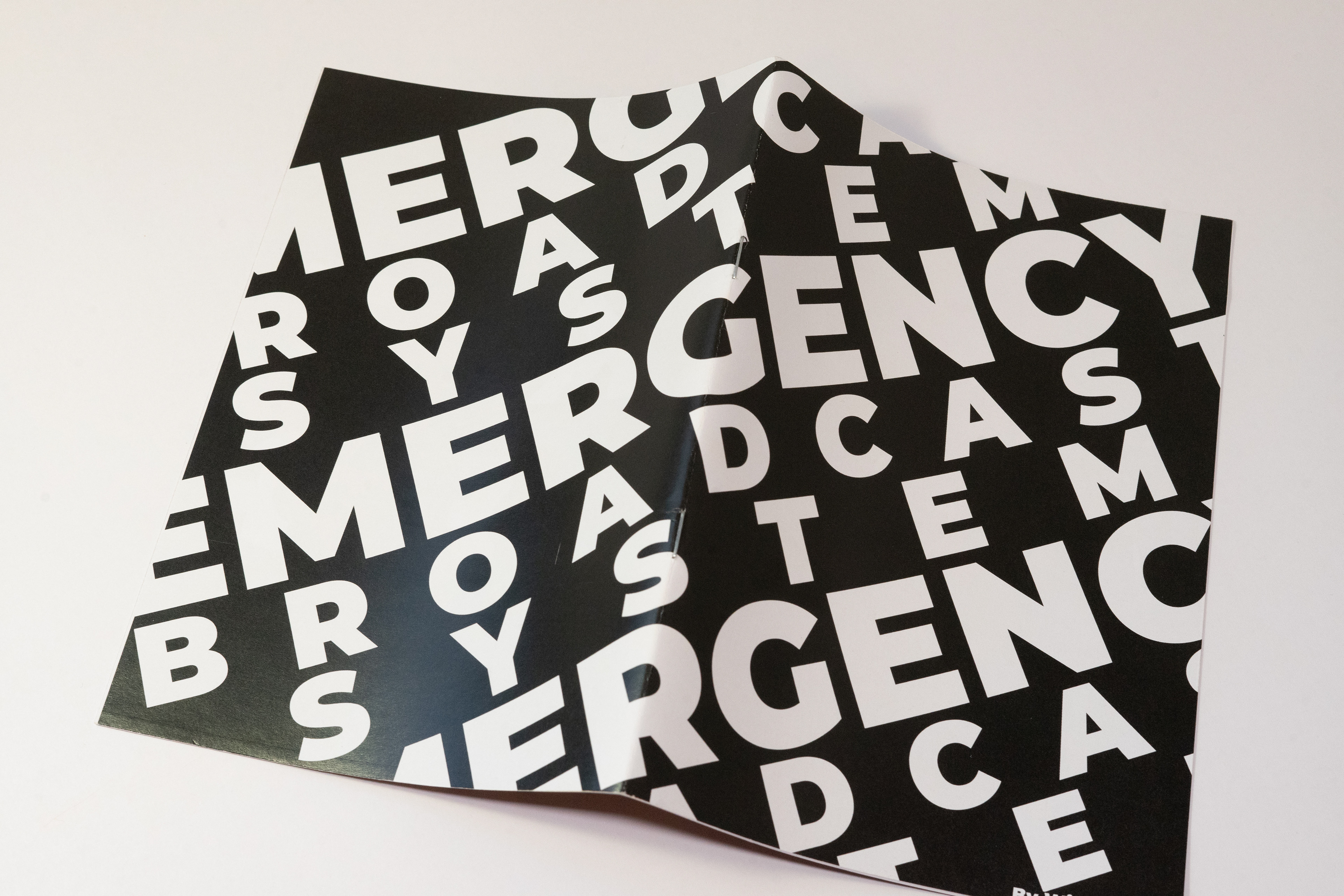
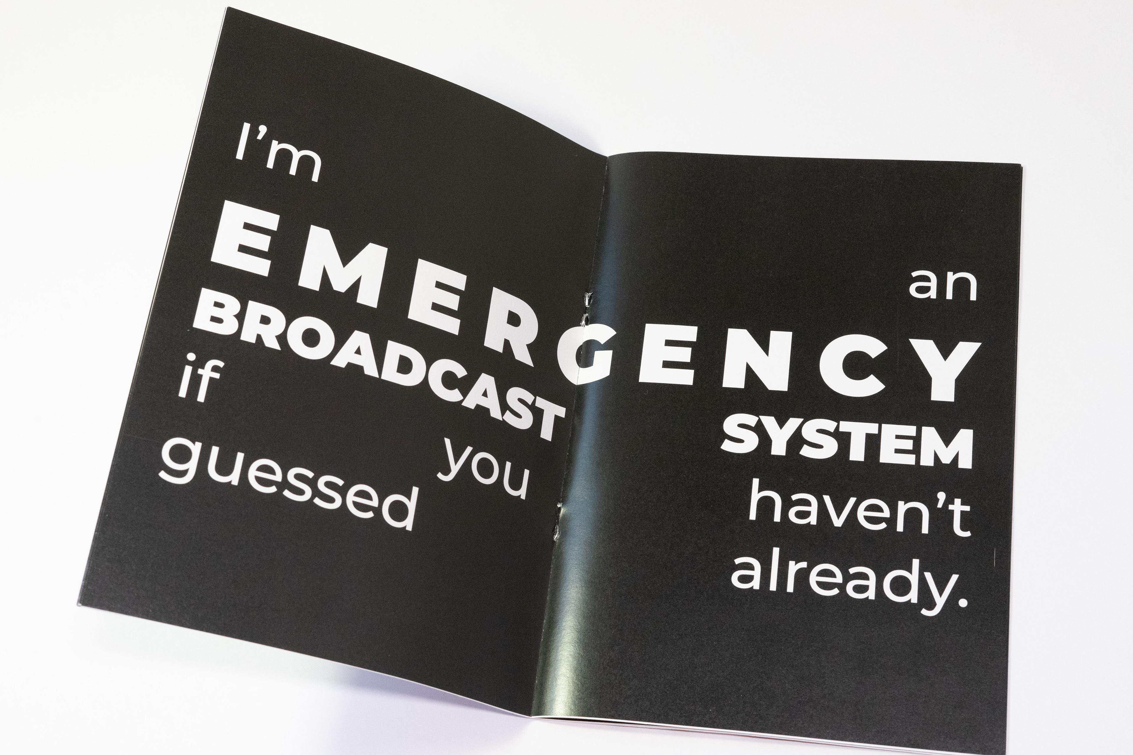
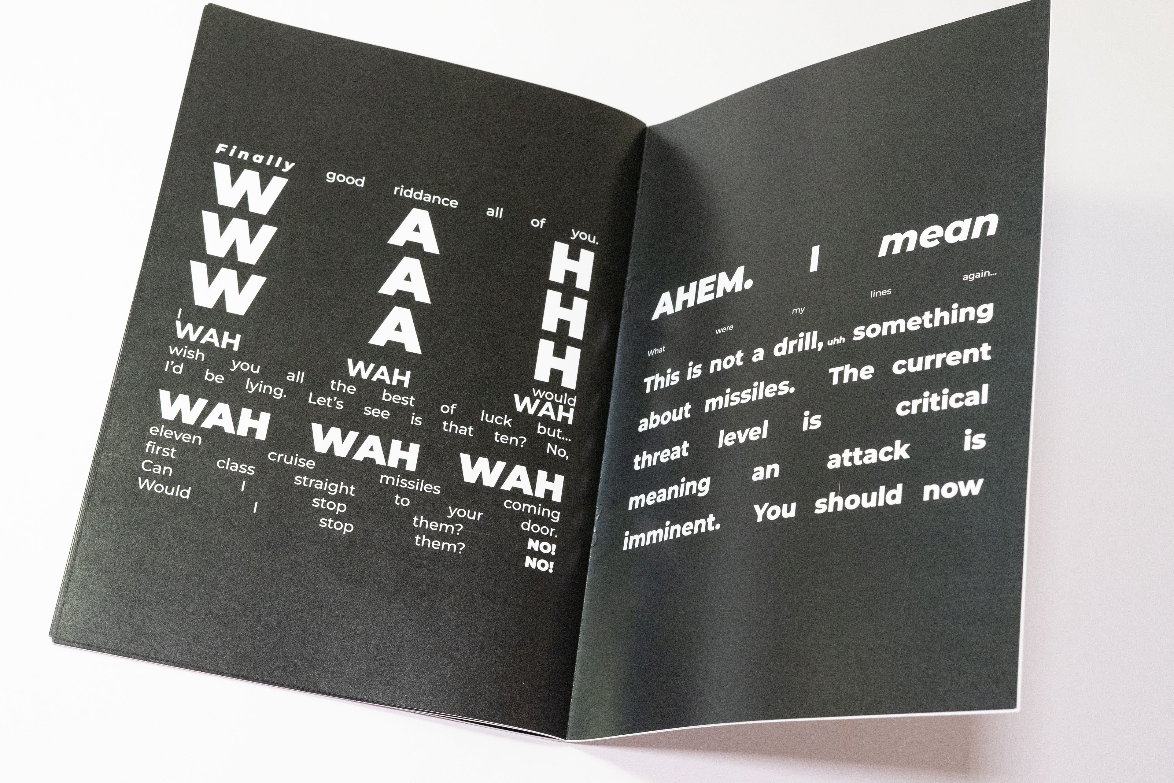
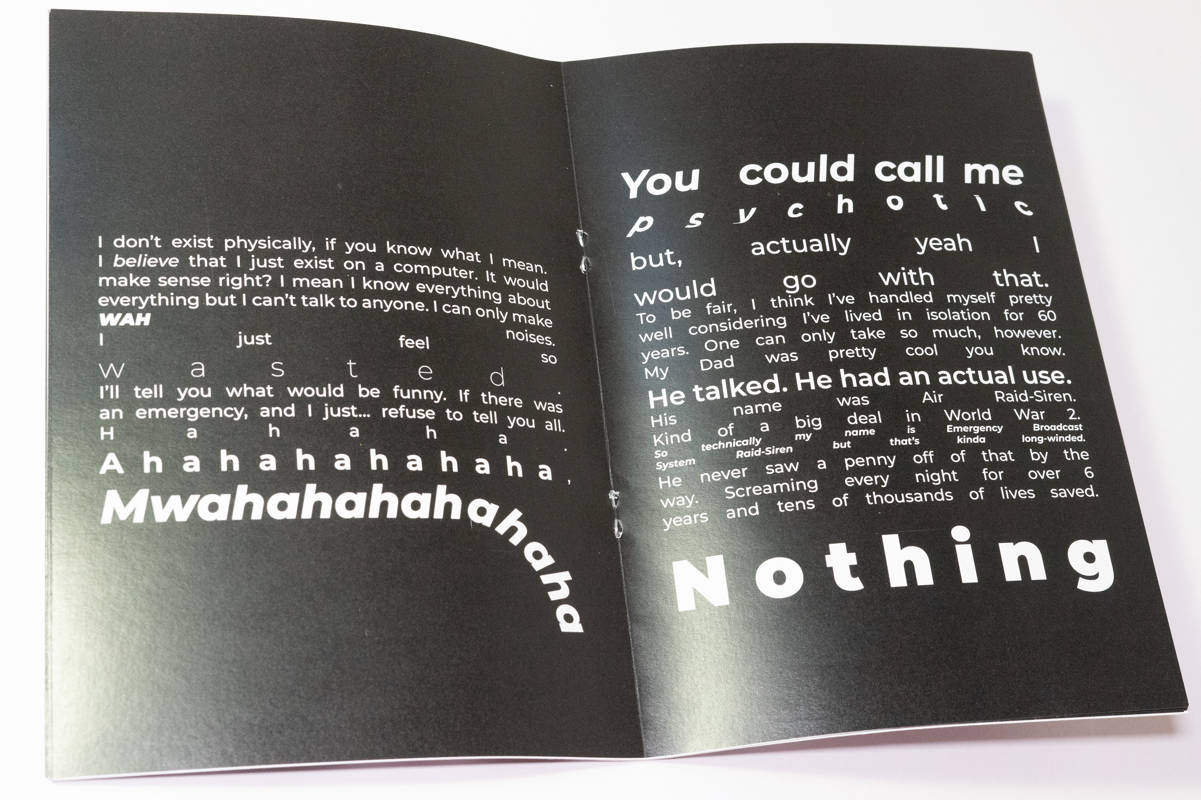
I wanted to reflect the feeling of nothingness with the way I used only black and white. I decided to go for white text on black, to give the effect as if it’s coming out of nowhere. My chosen typeface was Monserrat. This was because it contains many different fonts inside, giving it the versatility to use in multiple settings. For example, to start “Hey” is written in Extra Light Italics, which gives a feeling of innocence to a voice coming out of the darkness; however, the ending “TAKE COVER” written in Black, conveys a very different tone, very commanding and assertive, again, despite being the same typeface. I tried to utilise lots of different fonts throughout, all to try and convey the tone I heard as I wrote it. This also conveys the idea that we were to harness the “Kinetic Way Language Moves”. For some parts, I used Adobe Illustrator to add different effects, like the warp used in “Psychotic”. For the evil laugh, I used the ‘type on a path’ tool to make it sound like the voice is laughing endlessly before fading quietly into the background. I took inspiration from an artist shown during a lecture, Sister Corita. Her “Stop The Bombing” poster uses a ribbon-like effect on the statement as if it were a flag. Illustrator, I found, is great for manipulating type in similar ways. I wrapped the text around the front and rear covers of the book. This was to try and give the effect as though it were a poster plastered on the wall hurriedly to warn people of some impending emergency.
Outcome
I really enjoyed this project, and I think my outcome was successful. One of the issues I faced was timing. It got to the point that I hadn’t accounted for time to get my book printed at Bower Ashton, so I ended up completing most of the book in a couple of days. Despite that, I really enjoyed to process of manipulating each word to ‘sound’ the way I wanted, whether it be with italics, bold, or different sizes. I like working with the constraints of one typeface and only a few sizes. It also made me consider how to use type as imagery.